
Welcome to Week 1!
Hello, my friends! I'm so very excited! It's week one of the Lilian Star Quilt Along! If you haven't read the story of this pretty quilt pattern, you can find it here. This week we're selecting fabrics for our quilt. And there's a little, additional challenge each week. 
Each week on the blog, you'll find tips to go with each week's quilty task. I even made a YouTube video for each week! There are somewhat different things in the blog post and video, so be sure to check out both. Here's my first YouTube video ever on Color and Scale! If you'd subscribe, you'd make me feel much better about my life choice to go on camera. ;)
As we work on selecting our fabrics, I put together a mini-lesson on color and scale, as well as some tips to make shopping easier. I'm sure your fabric pull with be fabulous! But if you need a little extra help, read on!
Color
Selecting colors for a quilt is sometimes a challenge. Deciding on one color is even tough! Thinking about how you want the quilt to "feel" or the feeling you'd like it to give the recipient (or you!) helps to select the first color. Maybe it's a favorite color. Some people just have a knack to select perfect fabric pull. But a lot of time, perfection isn't needed! You just do what feels right to you. No stress. But if you'd like to learn more on design principles, I can give a few resources. ;)
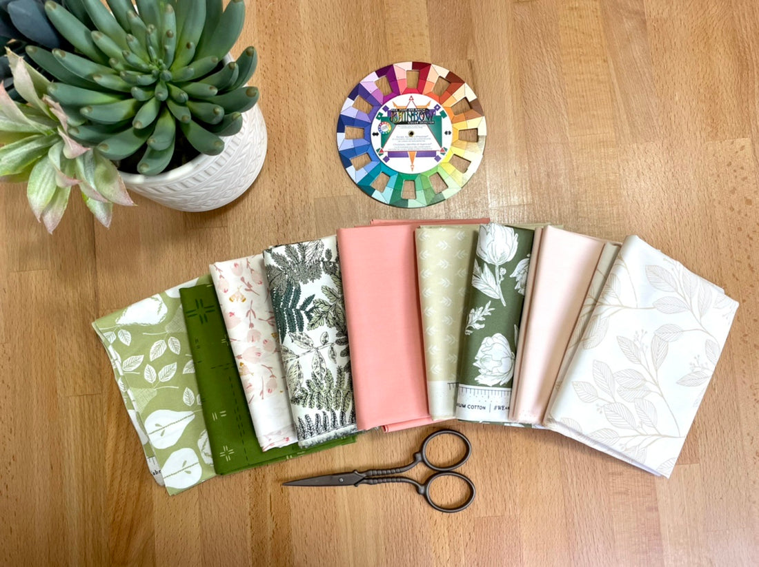
There's a book I picked up at a local shop: "A Fiber Artist's Guide to Color and Design" by Heather Thomas, that is basically a whole course on which colors match and great design practices, too! It's fantastic! Another great tool is a quilter's color wheel that helps you select coordinating colors. The Dritz Rainbow Color Wheel Selector is great! It comes with instructions on how to create complimentary color schemes, tertiary color schemes...it's just a great little system! I'll go through selecting a complimentary color scheme quilt in the scale discussion.

A no-fuss way to ensure colors go together is to buy from a certain collection. Art Gallery Fabrics has a great knack for helping you create effortlessly beautiful fabric pulls. If you look up a certain collection on their wholesale site (keep in mind you need to buy from a retailer who sells their products), like Kismet by Sharon Holland Designs, you'll see they have all the fabrics in the collection, including all their solids that match those fabrics! How great is that?!
But, if you're using fabrics from your stash or heading to the local fabric store, you may need a little extra help. I LOVE color cards. I have Robert Kaufman Kona Cotton color cards as well as Art Gallery Fabrics Pure Solids color cards. You can match them with your fabric at home if you'd like, then take them to the store and use them to find the perfect complement in any lighting. Also, super helpful when ordering online! Woohoo! You can even cut them up into more portable little cards.

Scale


